

Obsidian 样式 - Thino 样式
This content is not available in your language yet.
Obsidian 样式 - Thino 样式
注意
需要配合 Style Setting 插件使用
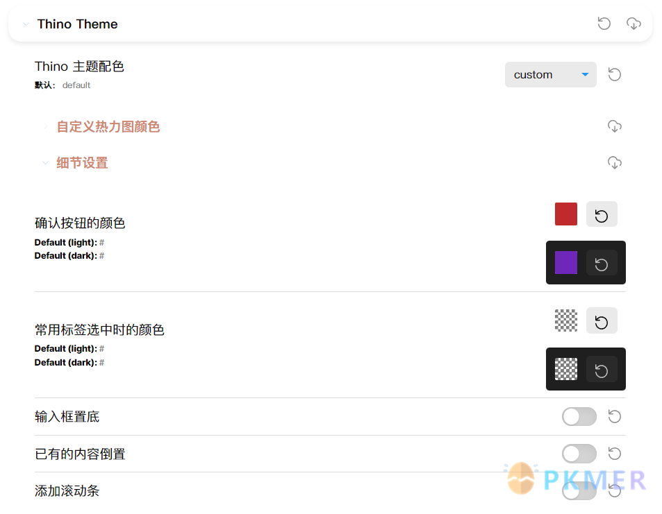
功能
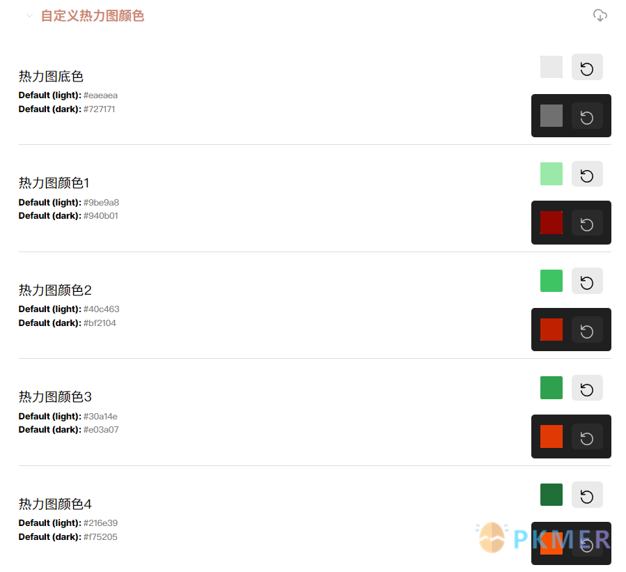
- 共 11 个热力图主题,可以在 Obsidian样式-给Thino搭配10种热力图颜色 查看具体样式
- 自定义热力图颜色、确认按钮颜色、标签选中时的颜色
- PC 端输入框置底
- 可以添加新内容追加到底部
- 滚动条
代码
/* @settings
name: Thino Themeid: thino-themesettings:  -    id: thino-theme    title: Thino theme    title.zh: Thino 主题配色    type: class-select    allowEmpty: false    default: thino-theme-default    options:      -        label: default        value: thino-theme-default      -        label: watery blue        value: thino-theme-watery-blue      -        label: forest        value: thino-theme-forest      -        label: gray        value: thino-theme-gray      -        label: green        value: thino-theme-green      -        label: nordic        value: thino-theme-nordic      -        label: deep sea        value: thino-theme-deep-sea      -        label: pink        value: thino-theme-pink      -        label: simple        value: thino-theme-simple      -        label: grass        value: thino-theme-grass      -        label: purple        value: thino-theme-purple      -        label: random        value: thino-theme-random      -        label: custom        value: thino-theme-custom  -    id: custom-heatmap-color    title: custom heatmap color    title.zh: 自定义热力图颜色    type: heading    level: 1    collapsed: true  -    id: thino-heatmap-bg    title: heatmap background color    title.zh: 热力图底色    type: variable-themed-color    format: hex    opacity: true    default-light: '#eaeaea'    default-dark: '#727171'  -    id: thino-heatmap-1    title: heatmap color 1    title.zh: 热力图颜色1    type: variable-themed-color    format: hex    opacity: true    default-light: '#9be9a8'    default-dark: '#940b01'  -    id: thino-heatmap-2    title: heatmap color 2    title.zh: 热力图颜色2    type: variable-themed-color    format: hex    opacity: true    default-light: '#40c463'    default-dark: '#bf2104'  -    id: thino-heatmap-3    title: heatmap color 3    title.zh: 热力图颜色3    type: variable-themed-color    format: hex    opacity: true    default-light: '#30a14e'    default-dark: '#e03a07'  -    id: thino-heatmap-4    title: heatmap color 4    title.zh: 热力图颜色4    type: variable-themed-color    format: hex    opacity: true    default-light: '#216e39'    default-dark: '#f75205'
  -    id: detail-settings    title: detail settings    title.zh: 细节设置    type: heading    level: 1    collapsed: true  -    id: thino-botton-color    title: Botton color    title.zh: 确认按钮的颜色    type: variable-themed-color    format: hex    opacity: true    default-light: '#'    default-dark: '#'  -    id: thino-tag-color    title: Tag color    title.zh: 常用标签选中时的颜色    type: variable-themed-color    format: hex    opacity: true    default-light: '#'    default-dark: '#'  -    id: thino-editor-position-bottom    title: place the editor at the bottom    title.zh: 输入框置底    type: class-toggle    default: false  -    id: memos-reverse    title: place the memos at the bottom    title.zh: 已有的内容倒置    type: class-toggle    default: false  -    id: thino-scrollbar    title: add a scrollbar in the memos    title.zh: 添加滚动条    type: class-toggle    default: false*/
body {  --thino-tag-color: var(--thino-heatmap-4);  --thino-botton-color: var(--thino-heatmap-4);}
.theme-light {  --thino-heatmap-bg: #eaeaea74;  --thino-heatmap-1: #9be9a8;  --thino-heatmap-2: #40c463;  --thino-heatmap-3: #30a14e;  --thino-heatmap-4: #216e39;}
.theme-dark {  --thino-heatmap-bg: #727171;  --thino-heatmap-1: #940b01;  --thino-heatmap-2: #bf2104;  --thino-heatmap-3: #e03a07;  --thino-heatmap-4: #f75205;}
body.thino-theme-watery-blue {  --thino-heatmap-bg: #eaeaea74;  --thino-heatmap-1: #ccd3dfea;  --thino-heatmap-2: #ACBDD2;  --thino-heatmap-3: #8DA6C6;  --thino-heatmap-4: #6D90B9;  --thino-botton-color: #648ec6;  --thino-tag-color: #6D90B9;}
.thino-theme-watery-blue div[data-type=thino_view] .memo-editor-wrapper.edit-ing {  border-color: #ACBDD2;}
body.thino-theme-forest {  --thino-heatmap-bg: #eaeaea74;  --thino-heatmap-1: #dad7cd;  --thino-heatmap-2: #a3b18a;  --thino-heatmap-3: #588157;  --thino-heatmap-4: #3a5a40;  --thino-botton-color: #344e41;  --thino-tag-color: #3a5a40;}
body.thino-theme-gray {  --memos-bg-lightgray: #eaeaea74;  --thino-heatmap-1: #dee2e6;  --thino-heatmap-2: #adb5bd;  --thino-heatmap-3: #495057;  --thino-heatmap-4: #212529;  --thino-botton-color: #6c757d;  --thino-tag-color: #212529;}
body.thino-theme-green {  --memos-bg-lightgray: #eaeaea74;  --thino-heatmap-1: #d8f3dc;  --thino-heatmap-2: #74c69d;  --thino-heatmap-3: #40916c;  --thino-heatmap-4: #1b4332;  --thino-botton-color: #2d6a4f;  --thino-tag-color: #40916c;}
body.thino-theme-nordic {  --memos-bg-lightgray: #e0e1dd;  --thino-heatmap-1: #778da9;  --thino-heatmap-2: #415a77;  --thino-heatmap-3: #1b263b;  --thino-heatmap-4: #0d1b2a;  --thino-botton-color: #415a77;  --thino-tag-color: #1b263b;}
body.thino-theme-deep-sea {  --memos-bg-lightgray: #caf0f84e;  --thino-heatmap-1: #90e0ef;  --thino-heatmap-2: #00b4d8;  --thino-heatmap-3: #0077b6;  --thino-heatmap-4: #03045e;  --thino-botton-color: #0077b6;  --thino-tag-color: #0077b6;}
body.thino-theme-pink {  --memos-bg-lightgray: #e0b1cb51;  --thino-heatmap-1: #e0b1cb;  --thino-heatmap-2: #be95c4;  --thino-heatmap-3: #9f86c0;  --thino-heatmap-4: #5e548e;  --thino-botton-color: #231942;  --thino-tag-color: #5e548e;}
body.thino-theme-simple {  --memos-bg-lightgray: #f2f2f2;  --thino-heatmap-1: #cccccc;  --thino-heatmap-2: #a5a5a5;  --thino-heatmap-3: #7f7f7f;  --thino-heatmap-4: #595959;  --thino-botton-color: #7f7f7f;  --thino-tag-color: #313131;}
body.thino-theme-grass {  --memos-bg-lightgray: #ddd8c4;  --thino-heatmap-1: #a3c9a8;  --thino-heatmap-2: #84b59f;  --thino-heatmap-3: #69a297;  --thino-heatmap-4: #50808e;  --thino-botton-color: #69a297;  --thino-tag-color: #50808e;}
body.thino-theme-purple {  --memos-bg-lightgray: #f5e6e8d7;  --thino-heatmap-1: #d5c6e0;  --thino-heatmap-2: #aaa1c8;  --thino-heatmap-3: #967aa1;  --thino-heatmap-4: #192a51;  --thino-botton-color: #967aa1;  --thino-tag-color: #aaa1c8;}
body.thino-theme-random {  --memos-bg-lightgray: #efc7c22b;  --thino-heatmap-1: #ffe5d4;  --thino-heatmap-2: #bfd3c1;  --thino-heatmap-3: #68a691;  --thino-heatmap-4: #694f5d;  --thino-botton-color: #694f5d;  --thino-tag-color: #68a691;}
.heatmap-default {  --memos-bg-lightgray: var(--thino-heatmap-bg);  --memos-stat-day-L1-bg: var(--thino-heatmap-1) !important;  --memos-stat-day-L2-bg: var(--thino-heatmap-2) !important;  --memos-stat-day-L3-bg: var(--thino-heatmap-3) !important;  --memos-stat-day-L4-bg: var(--thino-heatmap-4) !important;}
body:not(.thino-theme-custom) .setting-item[data-id="custom-heatmap-color"] {  display: none;}
div[data-type=thino_view] .common-editor-wrapper>.common-tools-wrapper>.btns-container>.confirm-btn {  background-color: var(--thino-botton-color);}
div[data-type=thino_view] .tags-wrapper>.tags-container .tag-item-container.active>.tag-text-container>* {  color: var(--thino-tag-color);}
.thino-editor-position-bottom div[data-type=thino_view] .memo-editor-wrapper {  order: 2;}
.thino-editor-position-bottom div[data-type=thino_view] .memolist-wrapper,.thino-editor-position-bottom div[data-type=thino_view] .memolist-wrapper .memolist-container .list-view.masonry-memolist {  max-height: 65vh;}
.thino-editor-position-bottom div[data-type=thino_view] .memolist-wrapper.completed {  padding-bottom: 10px;}
.memos-reverse div[data-type=thino_view] .memolist-wrapper .memolist-container .list-view .masonry-memolist-grid_column {  flex-direction: column-reverse;  overflow: auto;}
.memos-reverse div[data-type=thino_view] .memolist-wrapper>.status-text-container {  display: none;}
.thino-scrollbar div[data-type=thino_view] .memolist-wrapper .memolist-container .list-view.masonry-memolist {  max-height: 540px;  overflow: auto;}